- Amulum is a Roman-motif cookie project of the Institute of Archaeology in Belgrade, connected to the Roman site of Viminacium.
- We built the full launch: brand world, website, product imagery, packaging shots and a promo film, all from one direction.
- The starting material was a few phone photos, a blurry package shot and a loose idea.
- The main lesson for heritage product branding: the authentic detail is the brand. Protect it, light it, and build everything else around it.
Heritage products have a built-in story and a built-in trap. The story is real history. The trap is looking like a souvenir: beige, dusty and interchangeable with every other museum shop item. Amulum was a chance to show that heritage product branding can feel as current as any D2C launch without losing what makes the product authentic.
The brief
The Institute of Archaeology in Belgrade wanted to launch Amulum: cookies pressed with motifs inspired by Roman finds, linked to Viminacium, the Roman city and legionary fortress on the Danube that the Institute has researched for decades. The cookies needed a brand, a website and launch material that would work for visitors, gift buyers and the institution's own audience.
What existed at the start: a few product photos, a blurry package shot and a loose idea. No brand system, no product images that could go on a website, no film.
Finding the angle
The obvious direction was "ancient": stone textures, Latin type, sepia light. Every museum shop already looks like that. We asked a different question: what would make someone pick this box up in a shop and keep it after the cookies are gone?
The answer was the motifs themselves. Each cookie carries a pressed design taken from Roman material. That is the proof of authenticity and the reason the product exists. So the brand world was built to put those motifs in front, sharp and readable, inside a warm, museum-grade setting rather than a dusty one.
What we built
Product imagery in a 48-hour sprint
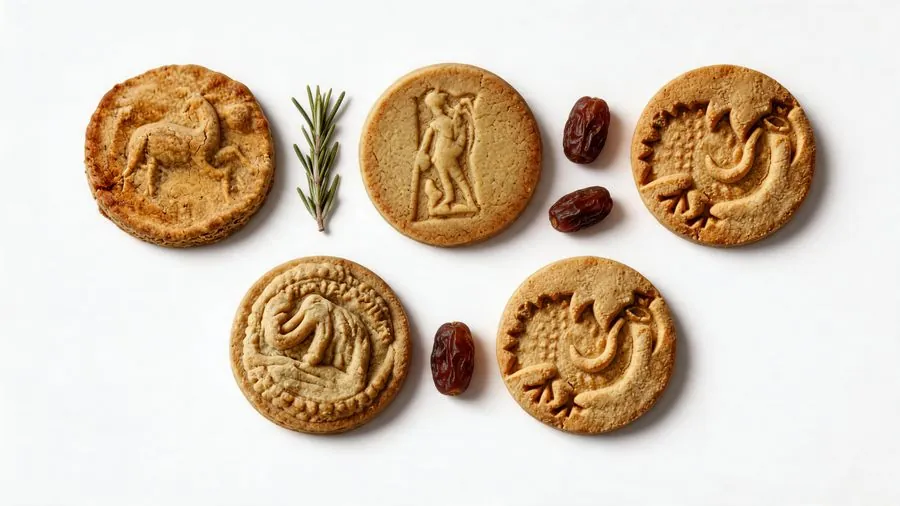
From the phone photos we built a product page set where the embossed motifs are finally readable. The motifs were treated as fixed detail: AI handled light, cleanup and the set, but was not allowed to reinterpret a single pressed line.
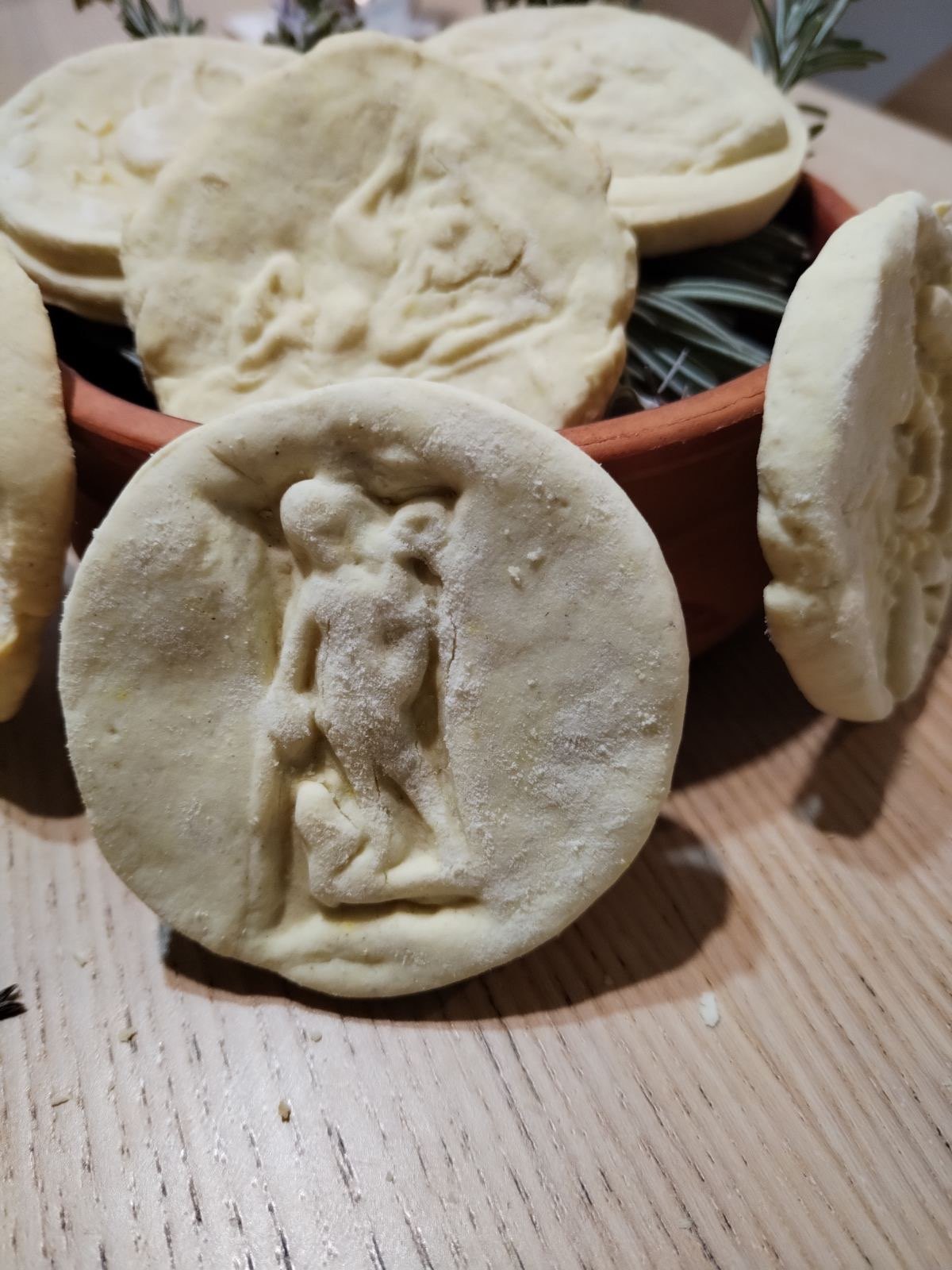
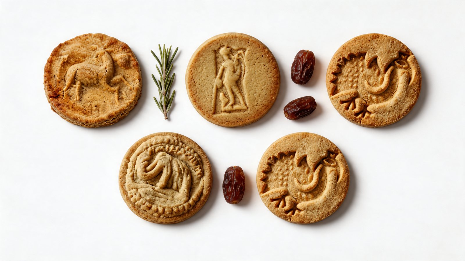
How this kind of rebuild works, and what has to be in the original photos for it to be possible, is explained in from phone photos to product photos.
The website
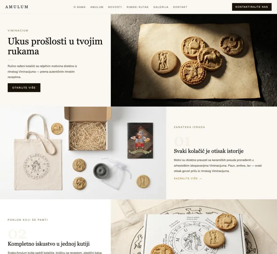
A heritage website for the cookies at kolaciciamulum.com: the product, the story of the motifs, and the connection to the Institute and Viminacium, presented so a visitor understands in seconds why these cookies are different.
Packaging shots and product visuals
Packaging and product visuals for the shop, social channels and the institution's own communication, all lit and styled as one set.
The promo film
A 14-second launch film, "Roman Viminacium", made from the approved direction without a film shoot, so the video looks like the website and the packshots. The method is described in how to make a product video ad without filming.
Six lessons for heritage product branding
- The authentic detail is the brand. Find the one element that only your product has (a motif, a recipe, a technique, a place) and make it the hero of every image.
- Make it readable. If the detail is too small, too soft or too dark to see, it does not exist for the buyer. Light and crop for the detail first.
- Old does not have to look old. Contemporary light and layout make history feel alive. Sepia makes it feel finished.
- Borrow the institution's trust, not its tone. The connection to a research institute is a strong proof point. It does not mean the product should speak like an academic paper.
- One visual world across every channel. Website, product images, packaging and film should look like they came from the same day. That consistency is what makes a small product feel established.
- Protect the facts. With heritage, accuracy is part of the value. Any AI-assisted image of an artefact-based design must be checked against the original.
Who this approach suits
Museums, archaeological sites, cultural institutions, regional food producers and craft brands with a real origin story. The same thinking guided our work for Woolkica, a handmade weaving and felting brand from Serbia, where the texture of hand-felted wool plays the role the motifs played for Amulum.
If you are planning a similar launch, our guides to AI product photography for brands and what a launch package costs are good next reads.
Have rough material for a product?
Send the phone photos, the PDF or a voice note. Qualified briefs get a first scope direction within 4 hours.